Bridge Of Spies (Spielberg, 2015)-

[1] Start Appeal-

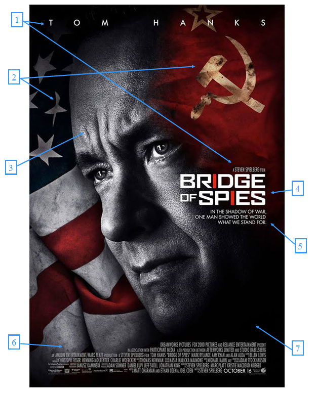
Writing “Tom Hanks” at the top of the poster can be used to make the film look more appealing to viewers as he is a well respected actor in the Hollywood industry. This can create Tom Hanks fans to want to see this film just because he stars in the film. Many posters do this to attract people to see a film for a actor in the film.
“Steven Spielberg” is also a well know name in terms of directors in Hollywood and so could have a similar appeal as his name just being in the poster can attract a lot of fandom. People who might have seen his other films and liked his work can be appealed to watch this film.
[2] Flags-
The flags are to symbolise the war between the two states that is going on in this time period. It emphasises the patriotism that people had for their country at the time as flags were commonly displayed through out these countries to show support that their country was better.
The flags being on opposite sides of the poster shows how different these two countries were by the totally different regimes they had at this time (USA being a democratic capitalist society while the USSR being a totalitarian dictatorship who followed communist ideas).
[3] Main Character-

This is the main character in the film played by Tom Hanks. He is not only on the poster to show that he is the main character but he is there to give a little on what the plot is about. His face being positioned in the middle of the two flags shows how he is the “Bridge of Spies”, he is to be the one connecting the two states together to create this “bridge” between two polar opposites. His straight face in this shot also shows that his job is one that is not easy and its very hard to do what he does. A sense of risk is also shown in this, as he is a man in the middle of a war between the USA and the USSR.
[4] Logo-

The logo font is very bold and uses a professional looking typography. This is to show that the film is based around the issues of the formal sector (Governmental issues) during the cold war between the USA and USSR. The wording “Bridge of Spies” is a direct link to the story in which the main character (played by Tom Hanks) connects the USA and USSR (a bridge is like a connection) through an agreement to trade each others spies whom the other has captured.
The red lines for the letter "I" are parallel and so can represent two opposing sides to this war and them being the same colour shows how there is no right side to the political argument but rather its a matter of opinion which is the right side of the two countries.
The red lines for the letter "I" are parallel and so can represent two opposing sides to this war and them being the same colour shows how there is no right side to the political argument but rather its a matter of opinion which is the right side of the two countries.
[5] Slogan-

This slogan promotes an idea that peace is better then war. Its a very motivational set of words the idea of “one man” making a difference is something that is very unusual and seen as quite impossible. This is used to give more on the plot from the poster and could help make more people see the film through the idea that the film is set on good moral values from the era, that peace was better than fighting a war.
[6] Information Block-

This text block is used in almost every film poster and includes information to do with the companies involved in the film’s budget, production and distribution. This block can also include other information like other cast members who might be less know or names of crew members like producers or editors.
[7] Colours-

The dark colours used in the poster such as the greys and blacks, give a sense of a lot of hidden secrets and mystery. In the cold war many things were hidden from the public eye (in order to promote propaganda) and from the eyes of the enemy, that is why spies were required in these times. This is a direct link to the narrative of the film as it give an idea of the mysteries of this time and the dangers that come by working out these hidden conflicts, The characters face is also given a grey colour and this shows he is linked to these hidden mysteries between the USA and the USSR, it could also maybe foreshadow something bad towards the character as he grey/ black can symbolise death, sorrow, hardship or suffering.

No comments:
Post a Comment