Tuesday, 12 April 2016

Evaluation Q7 - James Presland

Looking back at your preliminary task, what do you feel yo have learnt in the progression fro it to the full product?

I think I have made several large improvements when comparing my Preliminary task to my final project. This can be seen in  camera angles and shots,Equipment knowledge , research and planning.

Memory opening 

Preliminary task:


Camera angles and shots/Production
One way I feel I have improved since my preliminary task is my knowledge and understanding of camera angles and shots. One camera shot that we tried to focus on during out final project was the use of point of view (POV). We were not able to use this specific type of shot during our preliminary task as we lacked the skills and equipment in order to successfully carry it out. However, through research such as looking at examples from student made films on you tube and vimeo, we were able to know what place into the frame and really understand the effects we can create with having POV  and a wide angle shot e.g. Lens flare creating a glare effect. However after having multiple lessons focusing on Production elements on our final project e.g. learning how to position the camera to achieve a clear shot reverse shot i felt much more able to transfer these skills into the actual production.


Research/Pre-prodcution
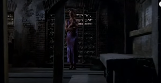
I learnt from this task that in order to create a successful plan and eventually a successful final project extensive research is needed. When comparing research between the preliminary task and the final project I can see that the research that went into the preliminary was very little and it mainly focused on camera shots and angles such as match on action and the 180 degree rule , however the research did not include any information about the genre.For the final project our research consisted of studying popular Thriller films in the genre. This research led me to two specific films ; The Sixth Sense( 1999 ) and Se7en ( 1995 ). This research into the genre helped me greatly as it gave me a general idea of what type Thriller i wanted the film to become. Research also consisted of surveys and research into what made a good Thriller. This also gave us information into who our target audience was. However ,research into costumes and props was studied less extensively. This was only necessary for the final project as for the preliminary we did not need genre based knowledge,

Equipment
During the preliminary task we were given a Canon DLSR 650D and a large tripod.At the time this felt like a lot of equipment especially as it was a first for many of us dealing with this equipment. However When it came to the actual final project I felt comfortable with the Canon 650D because of a lesson dedicated to getting to know the Camera and its many features which enabled us to film in low light situations and create effects such as glare.In addition we were given the chance to use several LED lights varying in size and type ( flood light or simple LED fill light ). These were very interesting to work with as they could enable us to shoot in poor light situations and also enable us to manipulate the effect of being stunned.

Pre-production
During the preliminary task we were tasked with featuring certain camera angles and shots such as match on action and shot reverse shot this led us into editing where we were tasked with continuity editing. For the final project these skills were extremely useful. Editing with final cut pro made the process very easy as provided us with the tools necessary to achieve the shots and angles we wanted. In the preliminary task we were very short on time however for the final project we had a significant amount more which I think is clear in the editing standards of both.

I feel the final project was very successful at completing the task and at using everything we had learnt from the preliminary task, however, I think we could have spent a longer time researching the props and costumes that needed to be used in the final project.

Friday, 8 April 2016

Evaluation Q6 - James Presland

What have you learnt about technologies from the process of constructing this product?
Memory Opening : 
Power point to presentation
Slide 1
 Slide 2
 Slide3
 Slide 4


 Slide 5
 Slide 6

Evaluation Q5 - James Presland


How did you attract/ address your audience?


Memory Opening :


Our target audience was the ages between 15 - 25. We felt this would be a suitable target audience as it being a relatively high ration at a rating we could include elements of gore and significant psychological thriller elements such as intrusive flashbacks and examples of mental trauma.


Film Poster:
I think a film poster is one of the most effective ways  for a distributor to advertise their film as it can be showed anywhere and it can be applied to a number of different marketing tools such as the internet and bus shelter advertisement spots and the classic bill boards. A lot of information is also provided and shown on the poster such as the release date of the film which is May 2016. Other information includes social media links, the name of the film , cast of the film and also the general genre of the film as seen in this poster with the antagonists face being one of the main features creates an intimidating atmosphere. 

Memory spot:
TV adverts is also another classic way to attract an audience as the trailer/ advert is shown to a significantly large viewer base.

Social Media: 

Social media is becoming an incredibly valuable tool to create attention for a film and to advertise the film.
These are some examples of how we are promoting/advertising our film on social media:

Facebook page and account.
This face book page would enable our fans to ask questions or comment on the film. This would enable us direct contact to our fans as Facebook provides a great creator to user interaction relationship/


The Facebook page also enables fans to connect with other fans through the film. The like button on Facebook also enables the film to be spread across the internet easily.

YouTube link

The YouTube  channel enables creators to release extracts from their films or behind the scenes films , this creates a larger fan base . YouTube is also crucial in terms of advertising a film as it has became so popular in recent years. With such a large viewer base this is a prefect opportunity to gather new fans


Evaluation Q4 - James Presland

Who would be the audience for your media product? Include audience feedback.

Memory Opening:


Target audience 

The target audience for our film was the age category of 15 - 25. The film was rated as a Film because of the nature of psychological thriller can be disturbing so this means it is only suitable for mature audiences.

Survey for feedback on Opening and Poster of memory:
This was a survey of 20 random people ( not media students ). The survey is based on their decision after seeing each extract to whether they would choose to see the film or not.
The number of people who would see the film after the viewing the opening : 15
The number of people who would see the film after the viewing the Poster : 17
The number of people who wouldn't he film after the viewing the opening : 5
The number of people who wouldn't he film after the viewing the Poster : 3

This graph clearly shows that most people found the poster more effective at persuading them to see the film.However , the Opening does have a strong majority in favour of viewing the film.

Evaluation Q3 - James Presland

What kind of media institution might distribute your media product and why?


Memory Opening: 


Director's commentary:

Distribution for Memory
The distribution company we made for 'Memory' was called 'Quad films'. As a feature film , the distributor is an organisation who dictates and controls the theatrical release of the film in multiple countries as well as handling the marketing and distribution of the film for personal viewing e.g. DVD, Streaming, Download and also television. Another responsibility of the distribution company is the marketing campaign this also dictates the advertising campaign.


Comparison between Quad Films and actual distributors (Hollywood)

20th-Century-Fox-Television-1997-twentieth-century-fox-film-corporation-20654751-1024-768Quad films is a separate organisation to the production companies ' Black Hole Productions' and also 'Dave & Co Productions' this is quite common of a low budget film such as memory however for a high budget movie production such as those in Hollywood they may have a distribution company within their bigger organisation. Such as 20th Century Fox who are primarily a major studio always have distribution company called Fox Searchlight Pictures.


Evaluation Q2 - James Presland

How does your media product represent particular social groups?
Protagonist:

Antagonist :
Me and Earl and the Dying Girl (2015,Alfonso Gomez-Rejon)


Protagonist:  The protagonist is effected hugely by his devastating mental illness and mental state. This mental illness causes him to have thoughts and visions of something terrible happening to him. The protagonist then believes that theses intrusive thoughts are going to occur to him or his loved ones. This makes him incredibly vulnerable and fearful for his life. The character is wearing the typical clothing of a troubled and distressed character;  he is wearing dull colours such as black, grey and white this also represents how he views life as if there is no colour and everything is going to harm him and everything he loves.

The Perks of Being a Wallflower(2012,Stephen Chbosky)


Antagonist: The antagonist conforms to many traditional thriller conventions as he wears both a mask and has limited dialogue. Both of these aspects contribute to an atmosphere of immense danger, villainism and secrecy. the antagonist has a very unique and devastating power over the protagonist as he can debilitate the protagonist without even saying anything.
The Dark Knight Rises (2012, Christopher Nolan)


Friday the 13th ( franchise)
The antagonist is also shown as being confident and strong as his body language is very front and forward this may suggest that he knows he has power and he takes enjoyment in others pain. However , The protagonist's body language is very tight and closed with his head down this clearly shows vulnerability in his character and that he is suffering.


Evaluation Q1 - James Presland


Memory opening scene :

Question 1:
In what way does your media product use, develop or challenge forms and conventions of real products?

9 frames:

Frame 1:

This frame is the image the audience sees. this is a production company's logo which is placed at the beginning of most films. This is a very iconic part of the film.

Distribution is an integral part to every film and with these logos 


We wanted to include logos as a group because we felt it gave a feeling of realism as all of the films shown in a lot of different media texts contain this.

Frame 2:
This was used as an establishing shot. This shot makes good use of the rule of thirds as the hand rail is positioned to the right of the frame not in the centre. 
 The location of this shot was also very important as the majority of the opening is shot on the same set of stairs. this enabled us to get a wide range of angles such panning shots, low angle shots and high angle shots to create suspense as the protagonist is ascending up the staircase. The reason why we decided to include this shot because we found it very effective at creating a unnerving, eerie and mysterious atmosphere. This shot is very similar to the opening of The Sixth Sense (M.Night Shyamalan,1999).


The camera shake used in our first establishing shot also creates a feeling of instability which provides a disconcerted and unsettled atmosphere for the audience. We created this camera shake by using a hand held filming technique instead of using a secure tripod.


Frame 3:

The main aspect of this shot was to integrate the credits in an interesting and creative way. We found lots of inspiration online. I particularly found Atonement ( Joe Wright, 2007 ) interesting because of how the credits are made to feel as though they flow through the opening.
 This set of credits contain credits to the producer : Osbert Menezes and the screenwriter : James Presland.
  The camera angle for this frame is slanted slightly this causes the stairs to appear straight on and flat. This enables us to place the credits on the stairs. Costume also plays an important role in this frame as it is the first time the audience is able to view the characters ( protagonist ) costume. The costume for the protagonist is a plain white sweater and black trousers. We chose this costume as we feel it added to the smart/dramatic atmosphere we tried to portray in the film. The costume was chosen to portray a well dressed man. We also considered the colour palette when choosing the costume as we did not want any bright colours. The colours we decided to choose for our opening were generally dull, dark and red colours.


Frame 4:
 When planning this shot/scene we had very specific details in mind. One detail we wanted to portray in the scene was a panning angle onto the protagonist as they walked upstairs This helped build tension and excitement. Another detail we wanted to portray in this scene was the whole staircase. This required us positioning the camera into a wide angle shot.

However unlike many Thriller films our opening scene lacks props. Especially this shot as you can see through mise-en-scene the protagonist is the only person in the shot. This also challenges the conventions of real Thrillers in high budget productions. On one hand, this enables the audience to be able to focus on the protagonist a lot more and no to be distracted by Props and the background. While on the other hand, this challenges the conventions this means that this is not typical of a Thriller film which may confuse the audience.

Frame 5:

This frame is very important as it is the first time the audience sees what the title of the film is 'Memory'. We wanted to show the title in an interesting way as it is integral to our opening. We wanted to personify the protagonists feeling of discomfort and agony so we placed the sound of a single heartbeat from a hospital monitor and sychronised that sound with a visual of red flashing across the title.

Frame 6:

This is a scene where the protagonist is having a vivid and intrusive thought. The blurred vision is created in final cut pro with a special function which allows you to keep a circle of the scene in focus and allow the surroundings to be blurred. The lighting used in this frame is very low and dark. the only light being used is a fill light positioned to the left of the protagonist. The camera angle is from the point of view of the protagonist who is being tied up and tortured. 

This is also very disorientating for the audience as the edits between the recent frames have been very fast. The protagonist is also visually in distress as he is tied up against his will. The white of the tape stands out from the dull and dark colours surrounding it. This could be shocking and alarming to the audience.


Frame 7:


This frame is very important in the opening sequence as it is the first time the audience can see the antagonist. this specific shot is a close up shot of the antagonist this shows his mask and face very clearly. However , the shot does also have a blurred effect. The costume aid of the bandanna also contributes to the ominous and threatening atmosphere that the antagonist creates.  


The aim of this shot was to introduce the audience into the world that the protagonist experiences. The light is focused on the antagonists face as he is supposed to be the centre of the shot.

Frame 8:


This frame is shot in the camera angle/position of point of view. This is straight after the mask of the protagonist is pulled off. The lens flare is created by placing a large fill light in the corner of the shot ( to the left of the antagonist). this gives the effect that the protagonist is stunned and flashed. The audio for this scene is a high pitch loud screech this gives a disorientating effect.

Frame 9: 


This is one of the final shots. This shot is very similar to the third frame. The use of the medium shot of the stairs is so that we could position the credits and lettering on each stair. The effect of positioning and re sizing each line of credits for each stair creates a sense of realism .